 Open Government Data: The Book
Informing Policy Decisions
Another type of government data is data that informs policy decisions. This data may not have much immediate economic value, but it guides better government decision-making and once those decisions have been made provides a context for evaluating those decisions. Although the value is not immediate, it is easy to identify. It is difficult to predict which applications of government data will succeed or fail, but it is easy to list the most important policy questions of the day and to find the data relevant to those questions.
The most interesting uses in this category often come from neighborhoods, and many are about public education. The National Neighborhood Indicators Partnership (NNIP) has been fostering the growth and sharing of neighborhood data since 1995. The partnership is made up of educational institutions, foundations, and local governments. In 2005, an NNIP partner in Chattanooga, Tennessee, assembled data that highlighted shortcomings in elementary school reading proficiency. In response to the new information, the county mayor created a Chief Reading Officer position.1 In Baltimore, the locations of two new charter schools which opened in 2005 were determined in collaboration with the Baltimore Neighborhood Indicators Alliance at the University of Baltimore using public demographic data.2
Here in DC, parents have many choices about where to send their children to school: public or charter, nearby or to a more desirable school, and so on. Our local Code for America Brigade, Code for DC, built a website to help parents navigate these complex choices using anonymized data they acquired from the Office of the State Superintendent of Education after a long negotiating process with the government. When the city began accepting feedback on school district boundary changes, the Code for DC team built http://www.ourdcschools.org/ to inform parents about upcoming changes and help them let the city know how those changes would affect their children.
In Cleveland, public data obtained by the NNIP guided welfare-to-work policy initiatives:
NNIP’s Cleveland partner mapped the residences of welfare recipients needing employment against the locations of new entry-level job openings in the metropolitan area. Doing so dramatized a serious spatial mismatch that caught the attention of policy makers. The existence of the data and tools (e.g., the ability to forecast changes in commute times that would result from alternative changes in transit routes and schedules) and the prominence the analysis was given in the press were credited as key motivators for a substantial state grant for welfare-to-work planning that brought child care planners as well as transit planners to the table for the first time on this issue.3
A persistent problem for Philadelphia has been its racial disparities. When I lived in Philadelphia during graduate school I saw first hand the geographic divisions created by the commercial corridor downtown and by the universities in West Philadelphia. Geographic isolation makes it easy to fail to see, or to ignore, other differences — such as racial disparities in the victims of crime. After the Philadelphia Inquirer collected data on homicides since 1988 and shared it using Google Fusion Tables, Josef Fruehwald, a graduate school colleague of mine, created the graph shown in Figure 1. Here is what he observed:
Since 1988, the African American community has been living in a Philadelphia with approximately a murder every day, or every other day. The White community, on the other hand, has been living in a Philadelphia with a murder once a week.4
There are two reasons why I chose to include this example here. First, Fruehwald’s analysis has a different purpose from most crime-based visualizations that data geeks have made over the last few years. Typical crime maps show what to avoid by reinforcing divisions. Fruehwald’s analysis, and especially his characterization of what it means, is instead about empathy and is rather humbling for those of us that lived in Philadelphia without knowing how bad it was for some communities.
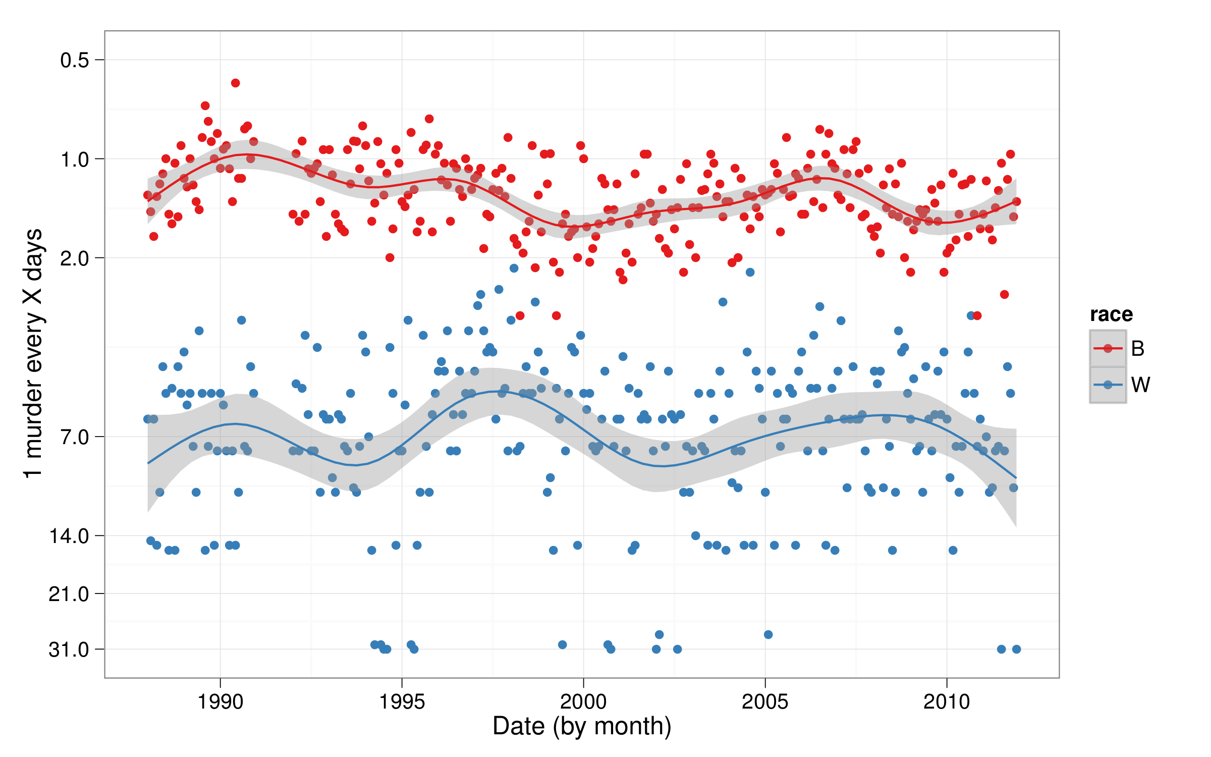 Figure 1. Murder rates in Philadelphia, 1988–2011, by race of the victim. By Josef Fruehwald, using data from The Philadelphia Inquirer.
The second reason for including Fruehwald’s analysis is more technical. Fruehwald’s choice of vertical axis, the murder rate, was carefully crafted to put the values into meaningful terms. It shows the average time between murders, in days, which is more understandable than the more typical measure of incidences per month or per year. This isn’t just a graph. It is a visualization made to convey a message.
Another problem for Philadelphia has been vacant land — blight. GroundedInPhilly.org, developed by a coalition of community garden and social justice advocates, maps the vacant lots in the city. Mark Headd, the City of Philadelphia’s first Chief Data Officer and a civic hacker, described GroundedInPhilly as a success for framing a local issue in a useful way. For instance, “if a user thinks [a lot] might be suitable to convert into a community garden there are resources available to assist,” Headd wrote.5 Great open data applications not only have a vision of a better world but create a path for making one.
-
Jake Cowan and G. Thomas Kingsley. 2007. Stories: Using Information in Community Building and Local Policy. Third Edition. ↩
-
ibid ↩
-
G. Thomas Kingsley and Kathryn L.S. Pettit. 2011. Quality of Life at a Finer Grain: The National Neighborhood Indicators Partnership, in M.J. Sirgy et al. (eds.), Community Quality-of-Life Indicators: Best Cases V. ↩
-
Josef Fruehwald. March 31, 2012. Val Systems: More on Philadelphia Homicide. ↩
-
Mark Headd. July 3, 2013. This Is How It’s Supposed To Work. ↩