 Open Government Data: The Book
Visualizing Metro Ridership
Ever since my move to Washington, D.C. I have been obsessed with the Metro system, our subway. In this section we’ll create a simple visualization of the growth of D.C. neighborhoods using historical ridership data at Metro rail stations. While open government data applications come in many forms, they often share a common set of methodological practices: acquiring the data, cleaning it up, transforming it into an app or infographic or some other presentation, and then sharing the progress with others. Each of these four steps can bring its own challenges, and we will walk through some of these challenges here.
If you are a would-be civic hacker, look out for some of the data processing tricks that follow. If you are a data publisher in government, look out for simple things you can do when you publish your data that can go a long way toward empowering the public to make better use of it.
The neighborhood that I live in, Columbia Heights, has undergone significant revitalization since its Metro station opened in 1999, and especially in the last several years. It has become one of the most economically and ethnically diverse areas of the city. I suspected, going into this example, that Metro ridership would reflect the growth of the community here. The problem I hope to solve is to answer questions about my neighborhood such as how it has changed, when has it changed, and whether the locations of new transit stations worked out well for the community.
Step 1: Get the data
The first step in any application built around government data is to acquire the data. In this example acquiring the data is straightforward. The Washington Metropolitan Area Transit Authority (WMATA) makes a good amount of data on its services available to the public. It even has a live API that provides rail station and bus stop information including arrival time predictions (which others have used in mobile apps). For this project, however, we need historical data.
WMATA has recorded average weekday passenger boardings by Metro rail station yearly since 1977, the first full year of operation for the subway-surface rail lines. Twenty-four stations were operational that year. The last line to finish construction, the Green Line, started operation in 1991. Historical ridership information by station is made available by WMATA in a PDF. PDFs are great to read, but we’ll see that they are pretty bad for sharing data with civic hackers. The location of the PDF “Metrorail Passenger Surveys: Average Weekday Passenger Boardings” is given in the footnote at the end of this sentence.1
If you are following along at home, download the PDF. Look it over to get a sense of global patterns. Is Metro ridership increasing over time? The final row of the table has total Metro ridership across all stations. It’s easy to see ridership has increased about five times over the past 30 years.
If you want to use the information in a serious way, such as to make a simple line graph of total ridership, you would quickly run into a problem for 2008. The number is missing! The PDF actually reads “######” as the total ridership for 2008. (See Figure 1.) Hash marks are what many spreadsheet applications write out when the actual number can’t fit within the size of the cell. WMATA had the number, but it got replaced with hash marks when their spreadsheet was printed as a PDF.
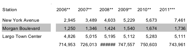 Figure 1. Part of the table of historical ridership by transit station from WMATA’s PDF. The last row is total ridership across all stations, but the PDF is missing the value for 2008, which was replaced by hash marks due to a formatting mistake.
If you want to make that graph, you can luckily sum up the 86 individual station ridership values in the column above it. Type 86 numbers into a calculator. Not hard, but you risk making a mistake. Wouldn’t it be nice to have the table in a spreadsheet program such as Microsoft Excel! That would make finding the 2008 value a breeze. This is the sort of problem we’ll run into as we get into dissecting the table in more detail next.
The second data set for this project provides latitude-longitude coordinates of all of the rail and bus stops in the WMATA system, which will be useful to plot ridership numbers on a map. WMATA provides this information in Google Transit Feed Specification (GTFS) format, which is a standard created by Google that transit authorities use to supply scheduling information for Google Maps Directions. Download google_transit.zip as well and extract the file stops.txt. The data totals 86 MB uncompressed, although we’ll only need a small slice of it.
WMATA, like many transit authorities, requires you to click through a license agreement before accessing the data. The terms are mostly innocuous except one about attribution which reads, “LICENSEE must state in legible bold print on the same page where WMATA Transit Information appears and in close proximity thereto, ‘WMATA Transit information provided on this site is subject to change without notice. For the most current information, please click here.’ ” (To WMATA: You can consider the previous sentence the attribution that is required for the figures displayed later on.) Although attribution is often innocuous, that doesn’t excuse WMATA from violating a core principle of open government data. Governments should not apply licenses to government data (see Principles).
Step 2: Scrub the data
What is normalization?
Government data is rarely in a form that will be useful to your application, if only because your idea is so new that no one thought to format the data for that need. Normalization is the process of adding structure. Even if your source data file is in CSV format (a spreadsheet), you’ll probably have to normalize something about it. Perhaps dollar amounts are entered in an unwieldy way, some with $-signs and some without (you’ll want to take them all out), parenthesis notation for negative numbers (you’ll want to turn these into simple minus signs), and so on. The goal is to get everything into a consistent format so when you get to the interesting programming stage (the “transformation”) you don’t have to worry about the details of the source data encoding as you are programming your application logic. That said, you’re lucky if that is the extent of your normalization work. Normalization often requires a combination of cheap automated tricks and some time consuming manual effort. That was the case here.
WMATA’s historical ridership table in a PDF is great for reading by people, but copying-and-pasting the text of the table from the PDF to a spreadsheet program won’t quite work. I tried it, and you can see the before-and-after result in Figure 2. Copying from PDFs is hit-or-miss. In this case, it’s a bit of a miss: the years, which were supposed to be column headers, are running row after row. Other rows are broken into two, and the names of transit stations that have spaces in their names (that is, they are multiple words) shifts over all of the ridership numbers into the wrong columns. It’s a mess. If a spreadsheet is going to be useful, we need the columns to line up!
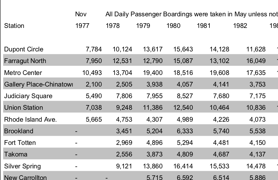
 Figure 2. Above: The table of historical ridership by transit station from WMATA’s PDF. Below: I tried copying the table in the WMATA historical ridership PDF into LibreOffice (which is like Microsoft Office, but typical on the Linux operating system).
At this point, one could clean up the spreadsheet by hand to get all of the numbers in the right place. In this example project, that’s reasonable. But that’s not always going to be possible. The U.S. House of Representatives publishes its expenses as a PDF that is 3,000+ pages long. Imagine copying and then cleaning up 3,000 pages of numbers. It would take a long time.
Converting a PDF to text
For the techies, here’s the more intimidating way to deal with problem PDFs. (Non-techies might want to skip the next few paragraphs.) The first thing I did with the PDF was convert it to plain text using a Linux command-line tool. It’s more or less what you’d get from copy-and-paste, but saved straight into a text file. (This is especially useful when you have more than a few pages to copy-and-paste, and the result can be cleaner anyway.) Here’s the command2:
pdftotext -layout historicalridership.pdf
The result is a text file (named historicalridership.txt) which looks conveniently like the PDF. That’s good, because next you’ll need to edit it. Here’s what we got in that file from the pdftotext program:
                        Nov          All Daily Passenger...
Station                 1977         1978         1979  ...

Dupont Circle                7,784       10,124       13...
Farragut North               7,950       12,531       12...
Metro Center                10,493       13,704       19...
First, the columns don’t really line up. Half-way through things get shifted over by a few characters. That means we’re not dealing with fixed-width records. Instead, we’ll have to treat the file as delimited by the only character that separates columns: spaces. That leads to the second problem: Spaces not only separate columns, they also are used within the names of multi-word stations. After running into this as a problem later, I came back and put quotes around the station names with spaces in them, knowing that LibreOffice Calc will ignore spaces that are within quotes. So then we have:
                        Nov          All Daily Passenger...
Station                 1977         1978         1979  ...

"Dupont Circle"                7,784       10,124       ...
"Farragut North"               7,950       12,531       ...
"Metro Center"                10,493       13,704       ...
After saving the file, I opened it up in LibreOffice Calc. (It’s handy at this point to give the file a .csv extension, otherwise LibreOffice prefers to open it as a word processing document, rather than as a spreadsheet.) It’s easier in LibreOffice Calc to finish off the normalization. LibreOffice Calc asks about how to open it: choose space as the delimiter, the quote as the text delimiter, and turn on “merge delimiters.”
Cleaning up the spreadsheet
Non-techies, glad to see you again, because you are not out of the woods yet. Even with the columns lining up, there is more clean-up to do in the spreadsheets: Use find-and-replace to delete all of the asterisks in the column headers (the asterisks referred to notes in the footer, but we want the years in the header to be plain numbers), delete the topmost header and bottom-most footer text so that all that’s left is the table header row (the years), the station names and ridership numbers, and the row of total system-wide ridership at the end — we’ll use that to check that the normalization was error-free.
We’re lucky that WMATA provided redundant information in the file. Redundant information is a great way to check that things are going right so far (the same concept is used in core Internet protocols to prevent data loss). The final row of the PDF is the total ridership by year — the sum of the ridership values by station. Since we can’t be too sure that LibreOffice Calc split up the columns correctly, a great double-check is comparing our own column sums with the totals from WMATA. Insert a row above the totals and make LibreOffice compute the sum of the numbers above for each year. (Enter “=SUM(B2:B87)” into the first cell and stretch it across the table to create totals for each column.) The numbers should match the totals already in the file just below it — and they do, until the column for 2008 which I noted earlier was filled with hash marks. It should be a relief to find an error in source data. Source data is never perfect, and if you haven’t found the problem it’ll bite you later. It’s always there. Anyway, since all of the other columns matched up, I assumed 2008 was okay, too. Delete the two summation rows (ours and theirs) as we don’t need redundant information anymore.
All this just to prepare the first data file for use, and we have two files to deal with. Think of all the time that WMATA could have saved us and everyone else trying to use these numbers if they had just given us their spreadsheet file. Had WMATA put in the few extra minutes ahead of time to give a link to their spreadsheet, it would have saved us half an hour (and multiply that by everyone else who did the same thing we did)! This is a great example of how data formats are not all equal. PDF is great for reading and printing, but it completely messes up tables. WMATA’s original file was probably a Microsoft Word or Excel file anyway — having either of those would have made our copy-paste job a breeze.
The second data file we’ll use has geographic coordinates of the transit stations. The final step of normalization involved some real manual labor to match stations in the historical data (our spreadsheet) to records in the GTFS data (in stops.txt). It was important to do this by hand because there were no consistent patterns in how stations were named across the two files. Some differences in names were:
| Historical File | GTFS File |
| Gallery Place-Chinatown | Gallery Place Chinatown Metro Station |
| Rhode Island Ave. | Rhode Island Metro Station |
| Brookland | Brookland-CUA Metro |
| McPherson Square | McPherson Sq Metro Station |
| Nat’l Airport (Regan) | National Airport Metro Station |
It’s more than common for the naming of things to be different in different data sets. Here the differences included: punctuation (space versus hyphen), abbreviations (“Nat’l”, “SQ”), missing small words (“Ave.”), and added words (“METRO STATION”, “-CUA”). In fact, WMATA’s file misspells the name of the airport station! Trying to automate matching the names could get you fouled up: several dozen bus stops on Rhode Island Ave all look something like “NW RHODE ISLAND AV & NW 3RD ST,” and you wouldn’t want to pick up one of these to match against the Rhode Island Ave. rail stop mentioned in the historical data.
I looked through stops.txt for each of the 86 rows (transit stops) in the historical data and typed in the stop_id from stops.txt into a new column called gtfs_stop_id. This took about 20 minutes. (While I was there I also fixed some typos in the stop names that came from the PDF.)
Note that I didn’t copy-and-paste in the latitude and longitude, but instead copied the stop_id. I did this for two reasons. First, it would have been more work to type up two numbers per station instead of one. Second, copying over the ID leaves open the possibility of linking the two files together in other ways later on if new ideas come up. We’ll do the real combination in the next step. (WMATA could have included the GTFS stop_id in the ridership table as well. A few more minutes on their part would save the rest of us a lot of repeated effort.)
Step 3: Build something
The creative part of any open government application is the transformation. This is where you take the normalized data and make something new of it. Something new can be a website to browse the data, a novel visualization, a mobile app, a research report. For this example, I wanted to create two visualizations. The first will be a simple line chart showing the raw ridership numbers from year to year. That chart will show us time trends such as when stations opened, which stations are still growing in ridership, and which have leveled out. The second visualization will be a map of the change in ridership from 2009 to 2010. A map will let us see trends across Metro lines and neighborhoods.
I’m a programmer, rather than a designer, so visualizations are not my thing. Fortunately, there are some good web sites that can create simple visualizations from data you upload. For the line chart, I used Google Docs. With the spreadsheet already cleaned up, it’s easy to copy the information from the spreadsheet into a Google Docs spreadsheet. Google Docs has a chart command that generates a decent chart. Though it does some odd things, so for Figure 3 I actually used Google Fusion Tables first, took a screenshot, and then edited the image by hand to make it more presentable. (Google Fusion Tables is a little harder to use and requires you to transpose the spreadsheet first, which I didn’t want to get into here.)
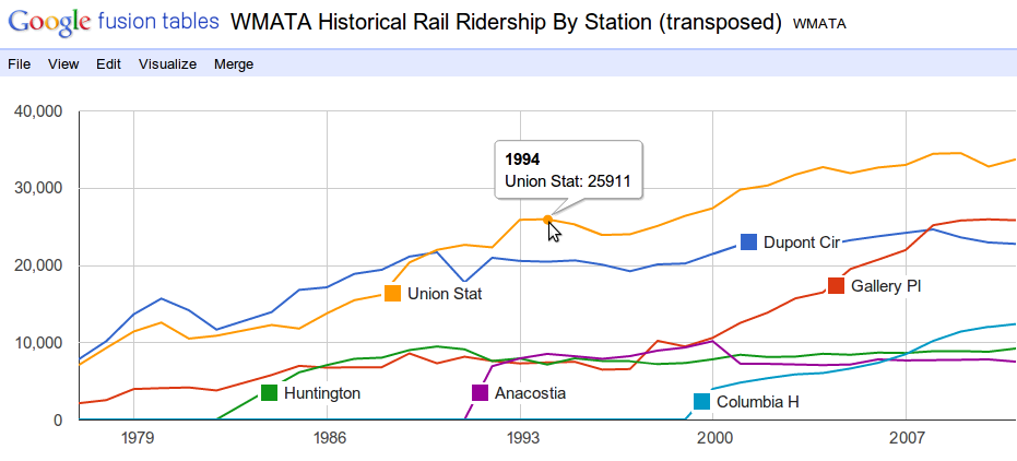 Figure 3. Average daily ridership in the WMATA rail system by year, for select stations, using Google Fusion Tables and then some Photoshopping after.
The chart helps us understand the data. First, we see the stations have been opening gradually since the initial two lines opened in 1977. As I suspected, the Columbia Heights metro station has been seeing continued growth in ridership since it opened. And it’s not due to a system-wide trend, since other stations including Dupont Circle, Huntington, and Anacostia have leveled off, and for the latter two leveled off in the initial years after they opened. We can also see that the ridership increase in the Gallery Place station that began in the late 1990’s is probably related to the opening of the northwest Green Line stations, which include Columbia Heights. Gallery Place is a transfer station between the Green and Red lines. The 12,386 passengers at Columbia Heights today accounts for three-fourths of the increase in ridership at Gallery Place since the year the Columbia Heights station opened (although this doesn’t include ridership at other new stations) — in other words, the Columbia Heights station probably was well placed and serves riders who weren’t served by a Metro station before.
The second visualization — a map — needs a more specialized visualization tool. OpenHeatMap.com turned out to be a fast way to get a map that could nicely display changes in ridership from year to year. It’s not as turn-key as Google Documents — this requires more preparation. OpenHeatMap lets you upload a spreadsheet but it wants the spreadsheet to contain three columns: latitude, longitude, and a numeric value that it will turn into the size of the marker at each point.
The visualization requires merging the historical data spreadsheet with the latitude and longitude in the stops.txt file. I wrote a 20-line Python script to do the work. I find it’s often better to program things than to do them by hand even if they seem like they will take the same amount of time, because a program’s errors are usually correctable faster than a mistake from manual work. The script reads in the two files and writes out a new spreadsheet (CSV file) with those three columns. For the value column, I chose to compute the following: (log(ridership2010/ridership2009)), in other words the logarithm of the ratio of 2010 ridership to 2009 ridership. Log-ratios are more handy than using plain ratios because they put percent-changes onto a scale that surrounds zero evenly. (For instance, a halving of ridership would be a ratio of .5 and doubling a ratio of 2, whereas on a log scale, with base 2, they are -1 and 1, respectively.) But a straight arithmetic difference would work well here, too ((ridership_{2010}-ridership_{2009})). See Figure 4. As with the line chart, I edited the image by hand after generating it. In this case I adjusted the colors, drew lines for the actual rail lines (otherwise just the markers would be there, which is a lot harder to interpret), and dropped in an icon for the Capitol from AOC.gov. It’s a perfectly fair thing to do to tweak the output you get — after all, the only point here is to make a good visualization.
Each visualization gives a different perspective. The map tells us uniquely about how the changes in ridership are distributed through the WMATA rail system. The smallest markers actually represent a decrease in ridership from 2009 to 2010 and those occur mostly on the Red Line, one of the two oldest lines. The largest growth is occurring throughout the Green Line (the primarily vertical north-south line). The two large green markers at top center are the Georgia Avenue-Petworth (above) and Columbia Heights (below) stations. That neighborhood is clearly still going through development, compared to most other areas of the DC metro area shown here, which have stable or decreasing ridership.
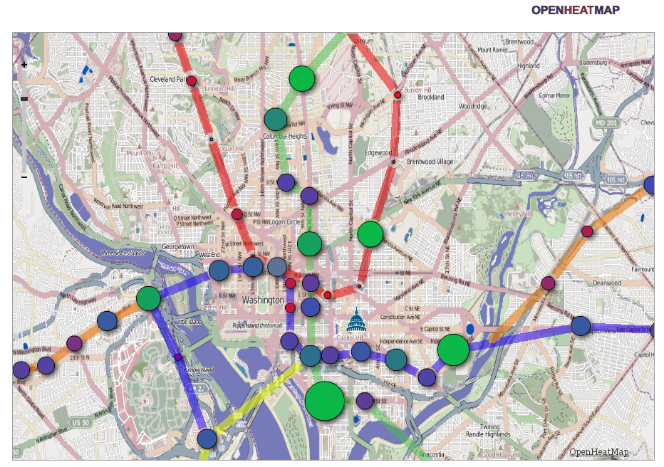 Figure 4. Ridership growth from 2009 to 2010 shown as the size and color of the circle markers located at each of the WMATA rail stations in downtown D.C, using openheatmap.com and some drawing by hand. The smallest circles actually represent a decrease in ridership.
Step 4: Distribute
Once you’ve found value in your data, please share it! Don’t make other folks go through the tiresome process of mirroring and normalizing the data if you’ve already done it. Don’t think it’s your responsibility to share? Just remember that you’re getting a big leg up by having your data handed to you — taxpayers probably payed a pretty penny to have that data collected and digitized in the first place. You can distribute your work by making your mirror and normalization code open source, posting a ZIP file of your normalized data files, and/or using rsync, github, Amazon EBS snapshots, or creating an API.
I’ve made my Google Docs spreadsheet public and the URL to access it is in the footnote at the end of this sentence.3 Feel free to copy the numbers from the spreadsheet to explore the data on your own!
-
http://www.wmata.com/pdfs/planning/Historical%20Rail%20Ridership%20By%20Station.pdf ↩
-
pdftotext was originally written by Glyph & Cog, LLC and can be found in the poppler-utils Debian package. ↩
-
https://spreadsheets.google.com/spreadsheet/ccc ?key=0Aur8IVEd28xddGhhWnNrT3B4UVlmYnNYTXE4QjFFTGc ↩